![[Code]Hammer](https://codehammer.io/wp-content/uploads/2023/01/cropped-Copy-of-CODE-HAMMER-1.png)
To create a drop-down button in MaterialUI, you need to use the components Button, Menu, and MenuItem, as well as track the open state of the menu with useState.
Drop-down menus are a great way to present navigation items to your user without taking up a ton of real-estate in your app. As with most things in MaterialUI, creating a drop-down menu attached to a button is fairly straightforward.
In this post we’ll start off with a full example of how to do this, in case you are here to just copy-and-paste (hey, I don’t judge) and then we’ll break it down in case you’re new to React or MaterialUI and explain each piece.
Table of Contents
Full example of how to create a drop-down button in MaterialUI
Let’s start with the answer, in case this is all you’re looking for:
import { useState } from "react";
import {
  Container,
  Button,
  Menu,
  MenuItem,
} from "@mui/material";

export default function App() {
  const [anchor, setAnchor] = useState(null);
  const onClick = (e) => setAnchor(e.currentTarget);
  const onClose = () => setAnchor(null);

  return (
    <Container>
      <Button onClick={onClick}>Hello</Button>
      <Menu anchorEl={anchor} open={!!anchor}>
        <MenuItem onClick={onClose}>Foo</MenuItem>
        <MenuItem onClick={onClose}>Bar</MenuItem>
        <MenuItem onClick={onClose}>Baz</MenuItem>
      </Menu>
    </Container>
  );
}We import the components we need, then we create a Button and a Menu that contains some MenuItems. We also need to track the anchor element for the menu so that it knows where to display, and also handle the onClose and onClick events for the menu and the button respectively.
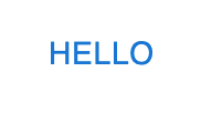
Here’s what the button looks like when it’s closed:
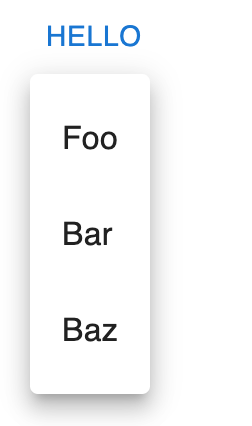
And here’s what it looks like when it’s open:
Make sense? Pretty easy. If not, we’ll go into further detail in the next section
Creating a drop-down button in MUI step-by-step
Let’s take the above example and break it down into more manageable parts.
Step 1: Import your components
The first thing you need to do is import all the parts you’ll need to make this work. We do this in React by using import statements at the top of the file. Here’s where we do it in the above example:
import { useState } from "react";
import {
  Container,
  Button,
  Menu,
  MenuItem,
} from "@mui/material";

export default function App() {
  const [anchor, setAnchor] = useState(null);
  const onClick = (e) => setAnchor(e.currentTarget);
  const onClose = () => setAnchor(null);

  return (
    <Container>
      <Button onClick={onClick}>Hello</Button>
      <Menu anchorEl={anchor} open={!!anchor}>
        <MenuItem onClick={onClose}>Foo</MenuItem>
        <MenuItem onClick={onClose}>Bar</MenuItem>
        <MenuItem onClick={onClose}>Baz</MenuItem>
      </Menu>
    </Container>
  );
}Here, we’re importing the following:
useStatefrom thereactpackage – this one comes with React. It’s a hook that allows us to keep track of the state from within a functional component.Containerfrom@mui/material– this component isn’t strictly necessary, but it’s the MUI way to contain your application. This could also be adivbut I figured since we’re using MUI we might as well do it the way they want us to.Buttonfrom@mui/material– this will be your anchor element for the menu. It’ll show up beneath the button when it’s clicked.Menufrom@mui/material– here’s where you’ll put yourMenuItems, which we’ll get to next. AllMenuItemsmust be within aMenu.MenuItemfrom@mui/material– each one of these will be one of your menu items. Pretty self-explanatory.
That’s all we’ll need for this example. Let’s move on to our actual component.
Step 2: handle your state and onClick and onClose events
Next we’re going to get into some of the actual logic of how the menu will function. It has to know where to show itself, when to show itself, and also when to disappear. We’ll handle the state part with the useState hook we imported earlier, and we’ll decide when to open and close it using the onClick event for the button and the onClose event for the menu items.
Here’s the code:
import { useState } from "react";
import {
  Container,
  Button,
  Menu,
  MenuItem,
} from "@mui/material";

export default function App() {
  const [anchor, setAnchor] = useState(null);
  const onClick = (e) => setAnchor(e.currentTarget);
  const onClose = () => setAnchor(null);

  return (
    <Container>
      <Button onClick={onClick}>Hello</Button>
      <Menu anchorEl={anchor} open={!!anchor}>
        <MenuItem onClick={onClose}>Foo</MenuItem>
        <MenuItem onClick={onClose}>Bar</MenuItem>
        <MenuItem onClick={onClose}>Baz</MenuItem>
      </Menu>
    </Container>
  );
}Let’s start with the first line where we handle the state of our menu. As we mentioned in step 1, we have to use the useState hook from the react package to handle state inside functional components. If we were to track the anchor element using just a regular variable, like const anchor = whatever, we’d lose that state every time the component was rendered. The useState hook allows us to track it between renders as well.
Next, we define the onClick and onClose functions. onClick will be assigned to the button we’re using for the menu’s anchor element. When we click the button, we set the anchor state to the current target of the click, which will be the button. onClose will be assigned to the menu items’ onClick events, which will close the menu. This is just to be able to close the menu for the purposes of this example. In a real app, you’d probably want your menu items to do something like navigate to a new page or trigger some sort of action.
Step 3: Render the components
In React, the way we render components in a functional component is to return their JSX. Here’s how we do that for our menu:
import { useState } from "react";
import {
  Container,
  Button,
  Menu,
  MenuItem,
} from "@mui/material";

export default function App() {
  const [anchor, setAnchor] = useState(null);
  const onClick = (e) => setAnchor(e.currentTarget);
  const onClose = () => setAnchor(null);

  return (
    <Container>
      <Button onClick={onClick}>Hello</Button>
      <Menu anchorEl={anchor} open={!!anchor}>
        <MenuItem onClick={onClose}>Foo</MenuItem>
        <MenuItem onClick={onClose}>Bar</MenuItem>
        <MenuItem onClick={onClose}>Baz</MenuItem>
      </Menu>
    </Container>
  );
}This part is pretty self explanatory if you’ve used React before. All we’re doing here is returning the components with the logic we defined earlier hooked-up and ready to go.
For the Button, we assign the onClick function we defined to set the anchor state equal to the target of the event, which is the Button itself.
For the Menu, we assign the anchorEl property to the anchor state, and set the open property equal to the boolean value of the anchor state. The double exclamation points (!!) are a short-hand way to determine the “truthiness” of a variable. Another way to do this would be Boolean(anchor). But, I’m lazy, and !! achieves the same result with less typing.
Finally, each MenuItem will cause the menu to disappear when clicked. This is accomplished by setting the anchor state to null when they’re clicked, which makes the open property of the Menu evaluate to false, since the truthiness of null is false.
Conclusion
Making a drop-down menu attached to a button in MUI is very easy. Once you import the proper components, you will just need to use useState to track the anchor element for the menu, and then wire that up to the menu itself to be open when there is an anchor element assigned, and closed when there isn’t. Have the button’s onClick event set the anchor element, and then it’s up to you to decide how and when the menu is closed. For the example I showed you above, we just close the menu (i.e., set the anchor element to null) when any of the menu items are clicked.

John is a professional software engineer who has been solving problems with code for 15+ years. He has experience with full stack web development, container orchestration, mobile development, DevOps, Windows and Linux kernel development, cybersecurity, and reverse engineering. In his spare time, he’s researching the potential business applications of AI.