![[Code]Hammer](https://codehammer.io/wp-content/uploads/2023/01/cropped-Copy-of-CODE-HAMMER-1.png)
You can create a simple navigation bar in Material UI using the AppBar component. Inside of it, use the Toolbar component, buttons, and whatever else you’d like to create your app’s navigation bar.
This example uses tinystack as its foundation. If you’re looking for a small, simple, single-container web stack to use as a starting point for your app, you should check it out on my GitHub.
Table of Contents
Import the MUI components
Before we can create our navigation bar, we need to import some components that we’ll use with it:
import {
    Box,
    IconButton,
    Button,
    AppBar,
    Toolbar,
    Typography,
    CircularProgress
} from "@mui/material";The components we’re importing above are:
Box– In MUI, this is essentially adivelement that we can use for grouping DOM elements and applying styles to themIconButton– this is a special type of button that takes an icon as a child element instead of text. You can use a regularButtonfor this, but it will end up taking up more horizontal spaceButton– We’ll use regular buttons for the navigation elements in the menu barAppBar– this is the most important one, our actual menu bar element. This is going to enclose our entire menu barToolbar– The toolbar will hold our navigation elements (Buttons in this case)Typography– MUI’sTypographycomponent is essentially aspantag, or can be treated as such. Depending on what you pass as thevariantproperty, it may or may not be aspanCircularProgress– This is just an animated loading indicator we’re going to use for one of our nav bar elements that requires AJAX calls
Define your navigation bar component
Next, let’s create the skeleton for our navigation bar:
export default function Nav() {
    return (
        <AppBar position="sticky">
        </AppBar>
    );
}Pretty simple, just a functional React component that returns the AppBar element for rendering with nothing in it. One thing to note is the position="sticky" prop, which we’ll get to in the next section below.
Sticky vs fixed positioning
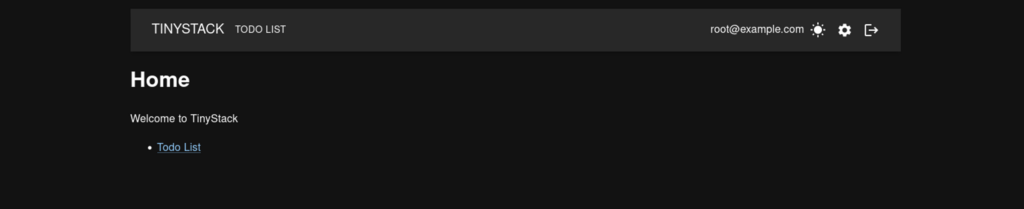
To make your app bar have “sticky” positioning, i.e., be confined by its containing element and stay on top of the page even if you scroll down, we just set its position prop to “sticky” like this:
<AppBar position="sticky">This will make it appear like below:
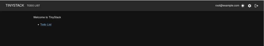
If you don’t specify the position prop, it will default to fixed positioning. This means it’ll expand to fit the entire viewport, and will scroll will the rest of the page:
<AppBar>Here’s what it looks like:
There are a few other position options, as well as other props you can set for the AppBar element. Check the MUI documentation on it for more info.
Add your buttons, links, and branding
Now we can use those other components we imported to flesh out our nav bar:
export default function Nav() {
    return (
        <AppBar position="sticky">
            <Toolbar>
                <Button color="inherit" component={Link} to="/">
                    <Typography variant="h6">Tinystack</Typography>
                </Button>
                <Button color="inherit" component={Link} to="/todos">
                    Todo List
                </Button>
                <Box
                    sx={{
                        display: "flex",
                        alignItems: "center",
                        marginLeft: "auto",
                    }}
                >
                    <UserInfo />
                </Box>
            </Toolbar>
        </AppBar>
    );
}We’re using the Toolbar element to hold our Buttons that we’re using for navigation. We set the component prop on those buttons to a react-router-dom link so that we can use them to navigate to the various SPA routes in our app.
You’ll notice the variant for the Typography element we’re using for our home page link / branding is set to h6. If you recall in the imports section, the Typography element can correspond to a variety of HTML text tags, and in this case it’s a heading.
Also on the Buttons, color="inherit" makes it so the text actually shows up. Without it, the text on the buttons will be the same color as the AppBar‘s background (blue, by default) and you won’t be able to read them.
Finally, you’ll notice the Box element with some styles applied. We want to use flexbox for this, and have it show up all the way on the right of the nav bar. This is where we’ll put our user info / links, such as current logged-in user name, logout button, and settings button. We’ll see the actual component we’re putting here in the next section with the full code.
Putting it all together
Here’s the full code for the tinystack app bar:
import { useContext } from "react";
import { DarkModeContext } from "./App.js";
import {
    Box,
    IconButton,
    Button,
    AppBar,
    Toolbar,
    Typography,
    CircularProgress
} from "@mui/material";
import LogoutIcon from "@mui/icons-material/Logout";
import SettingsIcon from "@mui/icons-material/Settings";
import WbSunnyIcon from "@mui/icons-material/WbSunny";
import Brightness3Icon from "@mui/icons-material/Brightness3";
import { Link } from "react-router-dom";

import { useUser, useLogout } from "./util";

function UserInfo() {
    const darkModeContext = useContext(DarkModeContext);
    const user = useUser();
    const logOut = useLogout();

    if (user.isLoading) return <CircularProgress />;

    return (
        <>
            <Typography>{user.data.email}</Typography>
            <IconButton color="inherit" onClick={() => darkModeContext.toggle()}>
                {darkModeContext.isDarkMode ? <WbSunnyIcon /> : <Brightness3Icon />}
            </IconButton>
            <IconButton color="inherit" component={Link} to="/settings">
                <SettingsIcon />
            </IconButton>
            <IconButton color="inherit" onClick={() => logOut.mutate()}>
                <LogoutIcon />
            </IconButton>
        </>
    );
}

export default function Nav() {
    return (
        <AppBar position="sticky">
            <Toolbar>
                <Button color="inherit" component={Link} to="/">
                    <Typography variant="h6">Tinystack</Typography>
                </Button>
                <Button color="inherit" component={Link} to="/todos">
                    Todo List
                </Button>
                <Box
                    sx={{
                        display: "flex",
                        alignItems: "center",
                        marginLeft: "auto",
                    }}
                >
                    <UserInfo />
                </Box>
            </Toolbar>
        </AppBar>
    );
}This should give you a good starting point to deviate from when developing your own nav bar for your app.
Conclusion
Adding a navigation bar to your app is very simple with Material-UI. It comes with an AppBar element included, which can then be combined with other MUI components such as Toolbar and Buttons to build it out however you want.

John is a professional software engineer who has been solving problems with code for 15+ years. He has experience with full stack web development, container orchestration, mobile development, DevOps, Windows and Linux kernel development, cybersecurity, and reverse engineering. In his spare time, he’s researching the potential business applications of AI.