![[Code]Hammer](https://codehammer.io/wp-content/uploads/2023/01/cropped-Copy-of-CODE-HAMMER-1.png)
You can use React’s useContext and useState hooks to toggle between dark and light mode in Material UI. First create a context and a state in the root of your app. Then, define the toggle function in your context that will modify the state. Finally, call that toggle function from one of the children to modify the “dark mode” state for your app.
This example uses tinystack as its foundation. If you’re looking for a small, simple, single-container web stack to use as a starting point for your app, you should check it out on my GitHub.
Table of Contents
Create a “dark mode” context
The first thing we need to do is create a context that will hold our dark mode state for the entire app:
export const DarkModeContext = createContext({
    isDarkMode: true,
    toggle: () => {},
});If you’re not familiar with the “context” concept in React, it’s simply a way to provide information to your components without having to explicitly pass it in props. This prevents what’s called “prop drilling”, where you have to pass the same value to a child prop, and it’s children, and it’s children’s children, etc., which is both tedious and error prone.
In the above code, we’re creating a context that’s an object with two properties:
isDarkMode– this is a boolean value that will be our actual “dark mode” statustoggle– this is a function that will (eventually) toggle dark mode on and off
If you’re wondering why our toggle function doesn’t do anything, that’s because it’s just a placeholder for now. This was something that thoroughly confused me in all the examples I found when I was originally learning how to use context in React.
Create a state to be the source of truth for the context
In order to actually keep track of the state of the context, we need to use React’s useState hook in whichever component we’re going to be creating the DarkModeContext.Provider tag:
const [darkMode, setDarkMode] = useState(true);This will just be a boolean value that defaults to true in this case.
Add a context provider tag to the root of your app
Next, in that same component, we want to create the context provider that wraps our entire app like this:
return (
    <DarkModeContext.Provider value={{isDarkMode: darkMode, toggle: () => setDarkMode(!darkMode)}}>
        <ThemeProvider theme={theme}>
            <QueryClientProvider client={queryClient}>
                <CssBaseline />
                <Container sx={{ mt: "1rem" }}>
                    <AuthLoader renderLoading={() => <CircularProgress />} renderUnauthenticated={() => <AuthPage />}>
                        <BrowserRouter>
                            <Nav />
                            <Box sx={{ mt: "1rem" }}>
                                <Routes>
                                    <Route path="/" element={<HomePage />} />
                                    <Route path="/settings" element={<SettingsPage />} />
                                    <Route path="/todos" element={<TodoPage />} />
                                </Routes>
                            </Box>
                        </BrowserRouter>
                    </AuthLoader>
                </Container>
            </QueryClientProvider>
        </ThemeProvider>
    </DarkModeContext.Provider>
);Here’s where it’s easy to get tripped up. If you notice, we’re passing the value prop as an object that looks a lot like the one we passed in createContext in the previous section. Why do we do this? Because these are the actual values we’ll be using in our app, and the ones we defined earlier were just placeholders.
The state of the context is not held within the context, it’s held within the component that defines the value prop on the context provider.
We’re using the state we defined with useState earlier to both set the value of isDarkMode and define the functionality of toggle.
Use useContext from one of the children to toggle between light and dark mode
Now, we can use useContext to get access to the darkMode state we defined from anywhere in our app. Here, we’re doing it in one of the components in our menu bar:
function UserInfo() {
    const darkModeContext = useContext(DarkModeContext);
    const user = useUser();
    const logOut = useLogout();

    if (user.isLoading) return <CircularProgress />;

    return (
        <>
            <Typography>{user.data.email}</Typography>
            <IconButton color="inherit" onClick={() => darkModeContext.toggle()}>
                { darkModeContext.isDarkMode ? <WbSunnyIcon /> : <Brightness3Icon /> }
            </IconButton>
            <IconButton color="inherit" component={Link} to="/settings">
                <SettingsIcon />
            </IconButton>
            <IconButton color="inherit" onClick={() => logOut.mutate()}>
                <LogoutIcon />
            </IconButton>
        </>
    );
}The first thing we’re doing above is calling useContext and passing it the context we defined at the very beginning of this tutorial. From here, we can call the toggle function on it when we click a button to switch between light and dark mode as you can see highlighted on lines 11-13.
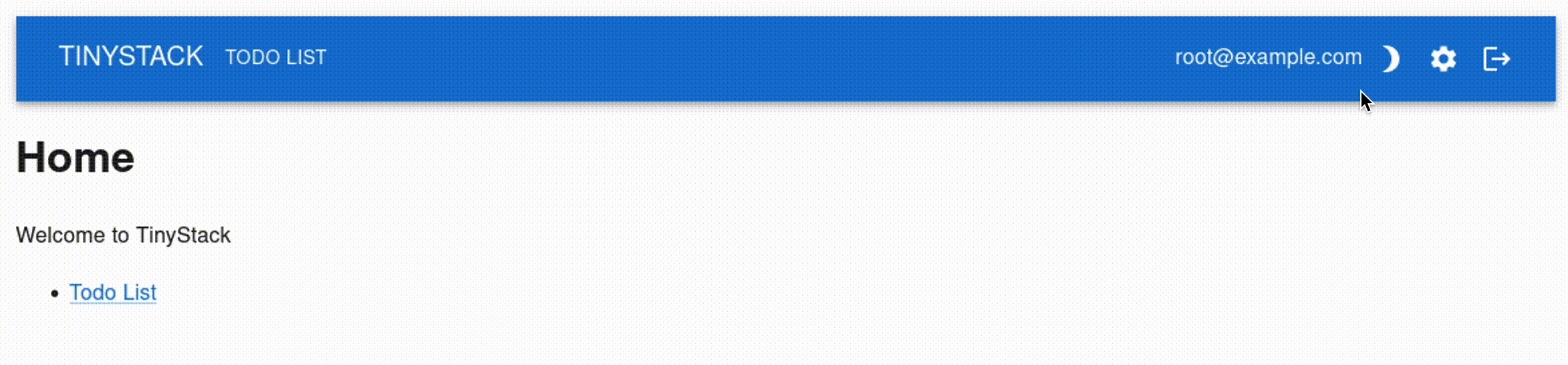
The final product
And here’s what it looks like when we’re all finished:
Conclusion
Toggling between dark and light mode in Material UI can be done easily with React’s useContext and createContext hooks. First you have to define a context with createContext that’ll hold the actual dark mode status as a boolean, and a function that can toggle it. Then, in your app’s root component, you create the actual dark mode state with useState, and pass it along with the actual toggle definition to the context provider’s value prop. Once that’s done, you can use useState to access this from anywhere in your app without having to pass it as a prop.

John is a professional software engineer who has been solving problems with code for 15+ years. He has experience with full stack web development, container orchestration, mobile development, DevOps, Windows and Linux kernel development, cybersecurity, and reverse engineering. In his spare time, he’s researching the potential business applications of AI.