![[Code]Hammer](https://codehammer.io/wp-content/uploads/2023/01/cropped-Copy-of-CODE-HAMMER-1.png)
Enable dark-mode by default in your MUI app by first importing ThemeProvider and createTheme. Then, create your theme with createTheme({palette: {mode: "dark"}}) and pass that as the theme prop for your <ThemeProvider> tag, which will wrap all the components you want the theme applied to.
This example uses tinystack as its foundation. If you’re looking for a small, simple, single-container web stack to use as a starting point for your app, you should check it out on my GitHub.
Table of Contents
The Default Theme
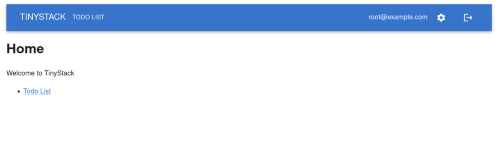
Let’s say we have the following site using Material UI. Material’s default color scheme of blue-on-white is ok, but very bright, and may not suit your app very well.
The Top-Level Component of the App
We can start by going to the root of our application. For our example, it’s App.js. This is where all of the top-level components are rendered:
import { QueryClientProvider } from "@tanstack/react-query";
import { CssBaseline, Container, Box, CircularProgress } from "@mui/material";
import { BrowserRouter, Routes, Route } from "react-router-dom";

import Nav from "./Nav.js";
import AuthPage from "./auth/AuthPage.js";
import HomePage from "./home/HomePage.js";
import TodoPage from "./todos/TodoPage.js";
import SettingsPage from "./settings/SettingsPage.js";
import { queryClient, AuthLoader } from "./util";

export default function App() {
    return (
        <QueryClientProvider client={queryClient}>
            <CssBaseline />
            <Container sx={{ mt: "1rem" }}>
                <AuthLoader renderLoading={() => <CircularProgress />} renderUnauthenticated={() => <AuthPage />}>
                    <BrowserRouter>
                        <Nav />
                        <Box sx={{ mt: "1rem" }}>
                            <Routes>
                                <Route path="/" element={<HomePage />} />
                                <Route path="/settings" element={<SettingsPage />} />
                                <Route path="/todos" element={<TodoPage />} />
                            </Routes>
                        </Box>
                    </BrowserRouter>
                </AuthLoader>
            </Container>
        </QueryClientProvider>
    );
}Create a Theme
Before we can start creating a theme, we need to import a couple things. At the top of our top level component, import the following:
import { ThemeProvider, createTheme } from '@mui/material/styles';These components are:
ThemeProvider– The tag that will wrap all of our components that use the theme we are going to createcreateTheme– The function that will take an object that defines our theme, and returns the theme that we’ll pass toThemeProvider.
The next thing we need to do is actually create the theme. If we just want to enable dark mode, the following is all we need:
const theme = createTheme({
    palette: {
        mode: "dark",
    }
});Apply the Theme
Now that we have our theme, we need to apply it somehow. For this, we use ThemeProvider in the top-level component of our application. We need to do this all the way at the top of the component tree because we want it applied to all the components.
So, in the render function of your top-level component, place the following:
return (
    <ThemeProvider theme={theme}>
        <QueryClientProvider client={queryClient}>
            <CssBaseline />
            <Container sx={{ mt: "1rem" }}>
                <AuthLoader renderLoading={() => <CircularProgress />} renderUnauthenticated={() => <AuthPage />}>
                    <BrowserRouter>
                        <Nav />
                        <Box sx={{ mt: "1rem" }}>
                            <Routes>
                                <Route path="/" element={<HomePage />} />
                                <Route path="/settings" element={<SettingsPage />} />
                                <Route path="/todos" element={<TodoPage />} />
                            </Routes>
                        </Box>
                    </BrowserRouter>
                </AuthLoader>
            </Container>
        </QueryClientProvider>
    </ThemeProvider>
);Putting it All Together
Here’s what the code looks like in our example app for the top-level component (App.js) with the added lines highlighted:
import { QueryClientProvider } from "@tanstack/react-query";
import { CssBaseline, Container, Box, CircularProgress } from "@mui/material";
import { BrowserRouter, Routes, Route } from "react-router-dom";
import { ThemeProvider, createTheme } from '@mui/material/styles';

import Nav from "./Nav.js";
import AuthPage from "./auth/AuthPage.js";
import HomePage from "./home/HomePage.js";
import TodoPage from "./todos/TodoPage.js";
import SettingsPage from "./settings/SettingsPage.js";
import { queryClient, AuthLoader } from "./util";

export default function App() {
    const theme = createTheme({
        palette: {
            mode: "dark",
        }
    });
    return (
        <ThemeProvider theme={theme}>
            <QueryClientProvider client={queryClient}>
                <CssBaseline />
                <Container sx={{ mt: "1rem" }}>
                    <AuthLoader renderLoading={() => <CircularProgress />} renderUnauthenticated={() => <AuthPage />}>
                        <BrowserRouter>
                            <Nav />
                            <Box sx={{ mt: "1rem" }}>
                                <Routes>
                                    <Route path="/" element={<HomePage />} />
                                    <Route path="/settings" element={<SettingsPage />} />
                                    <Route path="/todos" element={<TodoPage />} />
                                </Routes>
                            </Box>
                        </BrowserRouter>
                    </AuthLoader>
                </Container>
            </QueryClientProvider>
        </ThemeProvider>
    );
}The Final Product
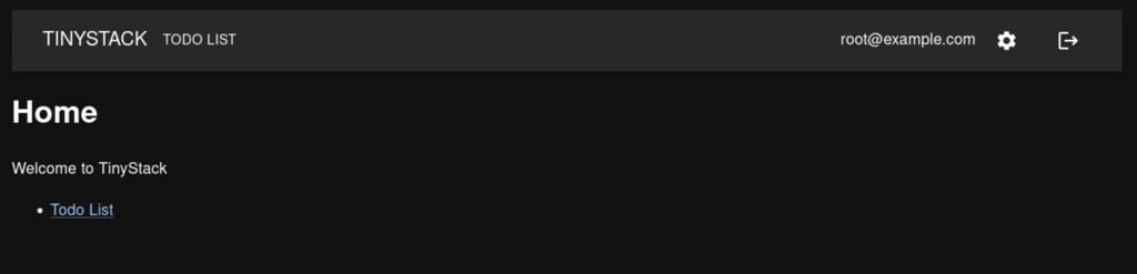
And here is what the final product looks like once we’ve applied our theme:
Conclusion
Implementing a “dark mode” style theme with Material UI is very simple. In fact, the the dark theme is already included in the theme functionality of Material, so adding it to your app only takes a few lines of code. Simply define your theme with palette: { mode: "dark" } and you’re good to go.
Next we’ll look at allowing the user to switch between light mode and dark mode.

John is a professional software engineer who has been solving problems with code for 15+ years. He has experience with full stack web development, container orchestration, mobile development, DevOps, Windows and Linux kernel development, cybersecurity, and reverse engineering. In his spare time, he’s researching the potential business applications of AI.